Friday, December 11, 2009

Runway Bonanza Part 5: Erdem

Florals can be tricky. There are a lot of pitfalls to avoid: done wrong, florals can make a grown woman look like she's trying to be a ten-year-old, or worse, like a Laura Ashley interior. Also, blooms that are either too large or too small on the wrong garment can make the wearer look bigger than she really is. That's why it's so impressive that Erdem showed a fantastic Spring 2010 collection that featured floral prints on many of the looks. Take the first look, for example:


Photo from Style.com (click the image to visit the source).


Photo from Style.com (click the image to visit the source).

From afar, the dress avoids looking prissy because of the short hemline and grown-up neckline (when was the last time you saw a simple standing collar on a little girl's dress?), but then up close it's even more fresh and hip because of the fantastic texture.

In later looks, the florals were appliquéd on silks, dispersing in spots to reveal the fabric underneath. This allowed designer Erdem Moralioglu to play with patterns twice over in the same garment: once in the floral itself and again in how and where they were applied.


Photo from Style.com (click the image to visit the source).


Photo from Style.com (click the image to visit the source).

Still other experiments with florals were done with "flat" printed fabrics rather than embroidery. While choosing complicated cuts is usually pointless with such an intense pattern, Moralioglu was able to show some interesting cuts that blended well with the patterns. You might only be able to see them when you are very close to the dress, but that's why it's great: like a Seurat painting, there's more to see once you're close up.


Photo from Style.com (click the image to visit the source).


Photo from Style.com (click the image to visit the source).

Later looks involving lace were perhaps less interesting but no less beautiful. Like the florals, they also managed to be modern and not too fussy. The spare hair and makeup selected for the models did help in that respect:


Photo from Style.com (click the image to visit the source).


Photo from Style.com (click the image to visit the source).

The one item that did look unapologetically retro, the lace-overlayed trench below, would be just as at home in Twiggy's closet circa 1967 as it would in a chic Londoner's closet today. What it lacks in innovation it more than makes up for in sheer charm.


Photo from Style.com (click the image to visit the source).


Photo from Style.com (click the image to visit the source).

With all this print, lace, and color, Moralioglu may have felt it necessary to throw in a few LBDs just to hedge his bets. Happily, this didn't result in brainless versions of the printed dresses in black or obviously-an-afterthought looks. Instead, Erdem used a black, wonderfully-textured material for either the skirt or top, and used something smoother for the other half of the frock.


Photo from Style.com (click the image to visit the source).


Photo from Style.com (click the image to visit the source).


Photo from Style.com (click the image to visit the source).

Simple, but great-looking. Not to mention wearable and yet special. I've always liked Erdem, but after this season I would consider myself a full-fledged fan. I'll be looking forward to their fall offerings.

Tuesday, December 8, 2009

Early Fall 2010 Predicitions: Part 2

For the first part of my Fall 2010 trend predictions, check out this previous post.

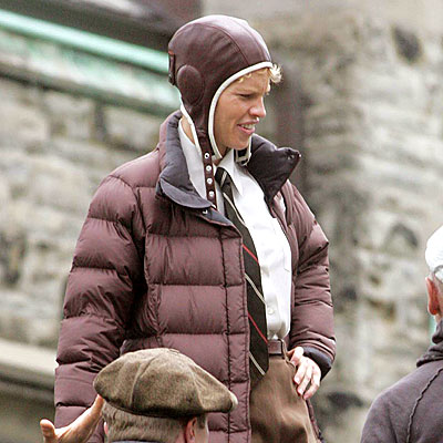
3. Military/Aviation. Admittedly, this isn't much of a prediciton. Everyone knows military looks were all over the spring runways--I'm simply predicting that the trend has enough steam to keep going for at least one more season. The crisp, severe looks that usually result from a military trend tend to work better for fall anyway. I do have one extra prediction relating to this trend that is new, however: I think that in fall, we're likely to see some looks based specifically on early aviation.


Photo from Style.com (click the image to visit the source).

This look from Burberry Prorsum's Pre-Fall 2010 collection is great; there is definitely something retro about the style, but not so overtly that it doesn't look hip and modern. While this is the only look from Pre-Fall 2010 so far that specifically recalls early aviation, Hilary Swank did recently play Amelia Earhart in a bio-pic, so the look may be fresh in designers minds.


Photo from TheFilmStage.com (click the image to visit the source).

Although the film didn't do terribly well, Swank's look from the film was seen enough leading up to the release of Amelia to have had the opportunity to inspire a designer or two. I've also predicted that the 1930s will be revisited next season, which if I'm correct, ties in easily with looks inspired by early aviation.

So how will this trend translate? The leather bomber with shearling lining (as in the Burberry look) is the sure-fire bet, but jodhpurs, boots, jumpsuits may also pop up. I wouldn't even be surprised if we saw goggles and leather caps with chin straps used on the runways as show accents, even if they don't make appearances in stores.

4. Medieval. Like the military trend, there were hints of medieval-flavored looks on the runways in spring. Since as a trend it make more sense with fall garments--capes, dark colors, rich embellishments--it's a fair bet for the fall collections. The items I saw in Spring 2010 collections that reminded me of medieval garments were quite subtle, but were definitely there:


Photo from Style.com (click the image to visit the source).

Okay, maybe because of my interest in costume history I see references to historic clothing when they're not explicitly there, but the gathering on the leggings and the tunic-like panel over the front of this Issey Miyake look reminds me of the leg bindings and early leggings you tend to see in medieval art. The cape is also reminiscent of medieval clothing. Below is an example of medieval leg binding:


An English King. Photo from Wikipedia (click the image to visit the source).

Early Medieval Celtic-style prints and motifs, featuring interwoven serpentine lines, made appearances in several shows this spring.


Rodarte. Photo from Style.com (click the image to visit the source).


Issey Miyake. Photo from Style.com (click the image to visit the source).


Givenchy. Photo from Style.com (click the image to visit the source).

I think this kind of print looks fresh at the moment. Plus, there's a kind of sinister vibe to these looks that I think appeals to a lot of designers trying to come up with hip clothes.

Sunday, December 6, 2009

Early Fall 2010 Predicitions: Part 1

The Fall 2010 shows are still about two months away, but I'm going to be bold and attempt to make some trend predictions now. I'll feature two today and two in a later post.

As a disclaimer, let me say that these are based mainly on hunches and what little can be gleaned from the Pre-Fall 2010 shows that are starting to surface. I have no insider knowledge of what any designer is planning for fall. However, I will explain why I think each of the trends I have picked are likely.

1. Chinoiserie/Japonisme. This is perhaps the most obvious and bankable of the trends for fall. For Karl Lagerfeld, his Far East-inspired Pre-Fall collection was derived from the brand new Chanel boutique that has just opened in Shanghai. With a video series highlighting the collection's development, a line of exclusive products only sold in the Shanghai boutique, and an interesting though somewhat painful to watch short film (see it all at Chanel's "Paris-Shanghai" website), the folks at Chanel are doing their best to create a lot of buzz. It's a Lagerfeld line we're talking about, so the buzz would have likely been there anyway.


Photo from Style.com (click the image to visit the source).


Photo from Style.com (click the image to visit the source).

But I wouldn't predict a trend wholly on what boils down to a business decision on Chanel's part to expand in China. Versace's pre-fall collection featured references to Japanese pop culture, and with great success. Hopefully Donatella will revisit this reference for fall, as it seems to mesh well with the Versace look.


Photo from Style.com (click the image to visit the source).


Photo from Style.com (click the image to visit the source).

A few kimono-style dresses and blouses and the occasional obi-like belt also popped up here and there on the Spring runways, which may indicate designer interest heading east.


Bottega Veneta. Photo from Style.com (click the image to visit the source).


Marchesa. Photo from Style.com (click the image to visit the source).

Maybe most convincingly, a dose of Chinoiserie/Japonisme just makes sense right now. Historically, the East-through-the-lens-of-the-West look means high glamor and exotic escapism. Although the economy seems to be slowly improving, a little old school glamor might still be what women will be looking for come fall. Lastly, Chinoiserie links with the next trend I'm predicting...

2. The Thirties. I think the 1930s will be present in Fall 2010 collections on two separate fronts: in silhouette and in detail. The silhouette of the thirties--slim, longer hemlines, full shoulder--is right at the moment. A lot of women are (or will soon be) tired of the tricky cuts and volume that have been on runways for the past few seasons. The body-con cuts on so many Spring runways are an indicator of that. Also, while I agree that the '80s trend may very well be on its way out (here is Tommy Ton's feature on the subject at Style.com), I think a full shoulder will be around awhile longer. This could easily translate to a 1970s revival as it did in some of the jackets at Stella McCartney's Spring 2010 show, but in many ways the look and silhouette of the '70s owe a lot to the 1930s (ahem, Biba).

The novelty prints and details of the 1930s, often derived from the work of Surrealists like Dali and Duchamp, are also likely to pop up this fall. Elsa Schiaparelli is my official vote for "Most Likely Historic Designer to be Referenced in Show Notes" next season. Zac Posen used hand and mouth motifs on jewelry and shoes for Spring, two shapes used by Schiap:


Photo from Style.com (click the image to visit the source).

For Pre-Fall, Posen again referenced the thirties, this time with bold plaids and novelty prints of bunnies, swans, and mushrooms. In fact, Posen's Pre-Fall collection may be the best example I can provide of the fine line between the 1930s and 1970s look:


Photo from Style.com (click the image to visit the source).


Photo from Style.com (click the image to visit the source).


Photo from Style.com (click the image to visit the source).

Several other designers presented bold prints reminiscent of the '30s and/or Surrealism this spring. I talked about the childlike prints at Miu Miu in a previous post, but here are some other examples:


Dries Van Noten. Photo from Style.com (click the image to visit the source).


Temperly. Photo from Style.com (click the image to visit the source).


I think we'll continue to see the 1930s referenced as Pre-Fall and Fall collections are presented.

Stay tuned for future Fall 2010 trend forecasts!

Wednesday, December 2, 2009

Runway Bonanza Part 4: Salvatore Ferragamo

Of all the collections that made the top of my favorites list this season, the Salvatore Ferragamo show surprised me the most. I couldn't recall a time in the recent past that I was wowed by the brand's runway offerings, but after checking out their Spring 2010 show I began to look forward to seeing their next collection. Then I read the Style.com review, explaining that their creative director Christina Oritz has been fired and that this was her last season at Ferragamo. Just my luck.

The review was relatively positive but wrapped up by saying that the collection was "in the end...a case of too little, too late" (click here to read the whole review). Since I couldn't remember them, I checked out Oritz's other four collections for Ferragamo. Her first two were maybe not as bad as the scathing reviews she received made them out to be, but they were nothing inspiring. The main complaint critics had was certainly valid: Oritz took this blue chip brand waaaaay too sexy. However, for Fall 2009, Oritz presented a knockout collection that featured very smart, clever cuts in luxe colors and fabrics. A few of my favorites:


Photo from Style.com (click the image to visit the source).


Photo from Style.com (click the image to visit the source).


Photo from Style.com (click the image to visit the source).


Photo from Style.com (click the image to visit the source).

Sexy, sure, but this time it was also polished. Still, Oritz must have some compulsive attraction to obscene amounts of skin, as her final looks consisted of totally transparent sweaters and great-looking evening skirts (which were, of course, easy to miss).

For Spring, the designer brightened up the palette but still showed sophisticated pieces that seem to hit that just-special-enough-without-being-silly mark. I especially loved the simple, loosely-fitted dresses shown with the type of tight, transparent, crew-necks that gave Oritz so much trouble in previous seasons.


Photo from Style.com (click the image to visit the source).


Photo from Style.com (click the image to visit the source).

The outerwear was also great. I'm usually suspicious of short sleeved coats (when do you wear a short sleeved coat?), but this one looks great:


Photo from Style.com (click the image to visit the source).

The length of the sleeves and the fact that it appears to be a lightweight leather is what makes this look good and seem practical. In early Spring it can go over a sweater on a chilly or rainy day, but later it can top lighter blouses or dresses. I also love the tiny slits throughout: they give the piece an edge. The red coat below, also in that light leather but with trench-coat details and a lowered waist, might be a harder sell because of its lack of shape, but it still looks fantastic on the runway:


Photo from Style.com (click the image to visit the source).

The last handful of items in a much darker palette had an almost medieval flavor, which may in fact turn out to be a trend when the Fall 2010 shows start. This section contained the items I myself would most want to wear.


Photo from Style.com (click the image to visit the source).


Photo from Style.com (click the image to visit the source).


Photo from Style.com (click the image to visit the source).


Photo from Style.com (click the image to visit the source).

I can't deny that there were clunkers: the strange jodhpurs were on the right track but totally missed. Also, the looks weren't quite as cohesive as they might have been. The end of the show looked a bit detached from the beginning, although if you were to evaluate them individually, I think they would be successful.

***

It seems unfair that Christina Oritz showed two bad collections, appeared to have heeded the criticism she received, followed those with two very good collections, and still got fired. You can understand Ferragamo's reasons: this is a recession and Oritz alienated the customer base with her first two shows. No matter what she showed next, certain fans might have just tuned out until she was replaced. Additionally, although judged simply as collections her last two seasons were fantastic, they were still probably racier than the Salvatore Ferragamo regular would like. It would futile to try to eradicate the all the skin from Ortiz's clearly sexy style completely. The good news is that things ended on a positive note. Oritz shouldn't be unemployed for long.

Sunday, November 22, 2009

Runway Bonanza Part 3: Miu Miu

Ah, Miucci Prada. No one else could make me want to wear blouses printed with napping nudes.


Photo from Style.com (click the image to visit the source).

I would even rock the matching skirt. What fashion devil did Miuccia Prada sell her soul to and where can I find him? In her spring 2010 collection, Prada's little sister collection was about innocence and the loss of it. This was expressed with a steady stream of schoolgirlish pieces in childish prints (cats, sparrows, daisies, and puppies). Then, the naked lady print was thrown into the mix, as if to catch you off guard. Presenting them this way, Prada almost seems to be saying something about how easy it is to make the transition from naïve girl to sexually-awakened adult. Or maybe she's just saying that the human form doesn't necessarily have to be classified as pornographic.


Photo from Style.com (click the image to visit the source).


Photo from Style.com (click the image to visit the source).

But the prints weren't the whole story. Let's not forget the innovative and yet desirable suiting in what appears to be a jacquard silk, with their short jackets and stovepipe pants. The look is slim, polished, and darkly quirky.


Photo from Style.com (click the image to visit the source).

The waist-sash is interesting: based on the pictures on Style.com, they are indeed attached to the jackets. There is something about it that is subtly bondage-like, like some kind of brace or extraneous strap. She also did a few similar pieces that were more akin to a cropped blouse, shortened to bolero length, and ruffled out at the bust.


Photo from Style.com (click the image to visit the source).

This type of shortened topper, which has popped up in other collections this season, could be a welcome alternative to a jacket or cardigan. It works over a collared blouse like it was shown on the Miu Miu runway, but I like the idea of it over a printed t-shirt or a low tank top, too.

I love the forties style of the silhouette and the cross-over top in this look. The skirt could be appealing to a wide variety of women.


Photo from Style.com (click the image to visit the source).


Photo from Style.com (click the image to visit the source).


Photo from Style.com (click the image to visit the source).

Prada's later pieces, studded with sequins but still using the prints and pointy '70s collars, were somewhat less successful in terms of their sales-floor appeal, but were none the less beautiful. This one below was my favorite:


Photo from Style.com (click the image to visit the source).

There's way too much going on, but then that's its charm.

I can't finish up without mentioning the shoes. Miuccia covered round-toed, chunky-heeled maryjanes with her cat, daisy, and sparrow print. Since Prada is usually one step ahead of everyone else, it makes sense that her shoes look very mid-nineties while everyone else is revisiting the eighties. I haven't wanted heels like that since junior high! With skinny jeans, a standard-issue suit, or a dress, they could be fantastic.


Photo from Style.com (click the image to visit the source).


Photo from Style.com (click the image to visit the source).

I could post images all day. I highly suggest that you go to Style.com right now and treat yourself to what is, in my opinion, one of the best collections of the season.